
Embark
Embark is a mobile app that helps Vancouverites find and strengthen relationships with likeminded individuals in the city to meet up and join in on casual, informal hangouts.
Rachel Bae and Jessica Fan | Semester-Long Project | Timeline: January 2019 - April 2019 (4 months)
Tools: Sketch, Illustrator and Origami Studio
Role
My role in the project was user research to better understand the problem space in eventgoing in Vancouver, visual design/art direction/copywriting to create a consistent brand palette, and user testing to obtain feedback from our intended users.
Context
This project was our final term project for an Interface Design course where our team chose a design area of interest, gathered research on the intended users within the design focus area and designed an interactive prototype that met the users' needs. As per feedback from the teaching staff, we received commendation for having the top project in the course.
Framing
After posting a thread on Vancouver’s Reddit page and from conversing with friends, we discovered that there was a need in the market to better connect Vancouverites in the city with more targeted, niche events to do. We decided to create a social mobile app that help connect eventgoers together based on their mutual interests.
Research shows that "social isolation is a prevalent problem in Vancouver – nearly ⅓ of 18 to 24 year olds in the region report ‘frequent’ loneliness" - Vancouver Foundation

Key Trends
We asked ourselves: “How might we address this issue of connecting eventgoers over mutual interests?”. This question prompted our team to map key themes we gathered from the Reddit thread, asking personal friends, external research and our perceptions as millennial event attendees. We grouped the findings into an affinity diagram utilizing the key topics of:
1) Issues in Vancouver
We tried to figure out the root cause of the perception of Vancouver as a “no fun city” and what the existing cultural experiences were like within Vancouver in order to better understand the overall situational context surrounding our mobile app.
2) Emotional causes of eventgoing
What motivated and drove eventgoing as a hobby for our target audience? This helped us create targeted personas and helped us better understand our target users.
3) Existing competitive landscape of event applications
We have to remember that our mobile application proposal should be sustainable in growth over the long-term so we tried to identify existing competitor applications and their key functionalities in order to drive a differentiated user experience within Embark’s end-to-end interaction model.
4) Aspirations of eventgoing
Could we try to identify what value our key target user wanted out of eventgoing? This could help inform differentiated features and ultimately meet and exceed the needs of our users.
Intended Users
Individuals Lacking an Existing Social Network
Before we began designing, we, as designers, needed to understand who our target users were and capture the data points into a representative profile. An example of an intended user is Cheryl, below, who wants to mingle with new social connections while integrating into a new cultural environment. On the other hand, the lonely individual can also be a local who feels isolated/does not have a large social circle. They may be hesitant/anxious about meeting new people but both groups ultimately want to break their personal boundaries and maintain sustainable relationships.
We see a greater need in the current market for a product that addresses the needs of the lonely individual as there is not currently anything that helps drive sustainable connections. Therefore, Embark will focus on addressing the pain points and frustrations for this kind of user group.


Process: Ideation
In terms of our research outcomes, we then made quick sketches to plan out the visual mockup based on the initial mental model of what our solution would look like and how it would function.
Search Process
We wanted to provide two methods of searching to cater to our intended users. This resulted in two main methods of searching: 1) Filter Form for those looking to personalize their search based on their niche preferences 2) Event Catalog for passive browsing to cater to the busy individual. To incorporate UX design trends and to improve navigation accessibility, a bottom toolbar would improve and streamline access to the app's content.


Initial Connections
By viewing the app through the lens of our intended user, Cheryl, she found it difficult to find likeminded people to go to events with as everyone around her seems to have an existing social circle. She hopes to meet people she can click with before going to the event, making the event experience less daunting. This is why we created a "Recommended Connections" section in the event detailed view that provides suggestions for potential user matches based on the mutual interest metadata the user puts on their profile. We believed that by having pre-selected suggestions based on mutual interests, users can more easily have a conversation starter point in order to interact with other likeminded users with the objective of building a connection before attending an event.

Sustaining Connections
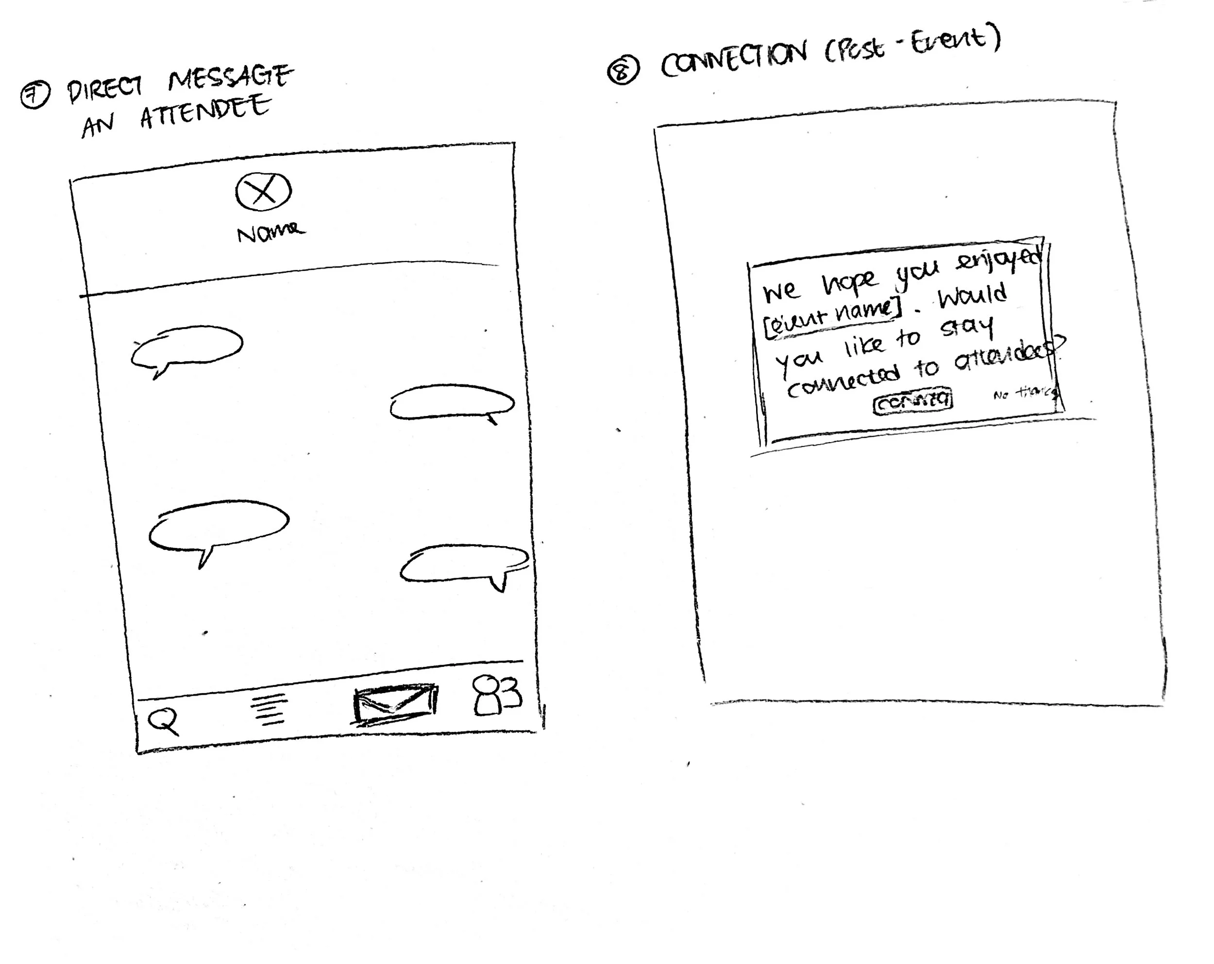
From our initial survey and research on existing competition, we uncovered that Vancouverites did not have a solution where they can easily connect with event attendees after an event. Thus, we created a visual pop-up prompt that triggers after an event, allowing users to view a detailed attendee list where they can connect with other Embark attendees in order to promote continued relationship-building in the app during one’s downtime.
Refinement
We then designed the sketches into visual screens using Sketch and transitioned the screens into an interactive prototype using Origami Studio. After conducting user testing through user interviews and A/B Testing to compare various layouts, we made a few changes to update the app based on the results we concluded.


Interactive Prototype: Search Process
Getting inspiration from an existing event-related app, Meetup, we refined the filter form to redirect the user to fill out subsequent pages once they tap on an empty blank in the natural language form as we believed this familiar visual cue would work with our intended users. Our design rationale was that user testers also preferred the ability to clearly see the options rather than be on the same page with smaller drop-downs that may strain their eyes.
Interactive Prototype: Initial Connections
We also added an "add" feature where event attendees can interactively add other users at the event using the phone's built-in accelerometer sensor by simply shaking the devices together like a handshake. Our user testers brought up a valid concern of feasibility when many users may be shaking at once so we reworded the copy so users were reminded that they needed to be in close proximity while shaking. We saw this feature as an opportunity to brand our app in a more distinctive manner by utilizing the interactive handshake as a metaphor for making a connection for the first time. This feature also aligns with emerging design trends where gestures are becoming the “new” type of screen interaction and our design goal of creating a sense of delight for our users.
Interactive Prototype: Sustaining Connections
As per critique from the teaching staff, we discovered that users mainly will not stay in the app after an event so we identified an opportunity to send a friendly reminder in the phone's lock screen to redirect the user to go back into the app to reconnect with event attendees, in order to sustain Embark's usage. This key feature would also address the gap in the existing app marketplace where our intended user can easily keep in touch with event attendees they may have met after an event in order to strengthen the relationship creation process.
Success Metrics
We were able to distinguish our design’s success by conducting 10 usability testing sessions, synthesizing the main themes of feedback that we received and implementing the findings through modifying the design elements. Further, we also received positive commendation from the teaching staff, recommending that our team reach out to the City of Vancouver to start this project as an actual mobile application that can downloaded by local Vancouverites to use!
Reflection
I learned a lot about conducting heuristic evaluations to better identify issues within an interface's design and iterate a design to make the interface more usable for an audience by conducting user testing. We found it challenging to make it interactive using Origami Studio as we needed to learn the software from scratch and understand the different triggers, conditions, and events associated with a simple user tap. This project taught me the importance of questioning every feature and whether or not it made sense for the bigger strategic picture of the app's purpose and the users which shifted my design perspective when working on design projects.